The logo of ABS-CBN has been in use for almost four decades. Before the merger three different logos were used. Originally a symbol, it eventually rose to become the most recognizable media insignia in the Philippines.
History[]

ABS-CBN's logo 1967-1972
In 1966 before ABS and CBN merged, the original logo was modified by Davis Architects which were the architect of the Bryant-Denny Stadium and Leandro Locsin, architect of the Philippine International Convention Center (PICC).
In 1967, with the incorporation and final merger of the Quirino-owned Alto Broadcasting System (ABS) and the Lopez-owned Chronicle Broadcasting Network (CBN), the logo was revised with the same original graphic elements and including the CBN typography. The logo was rendered in black and white for station ID.

the logo 1986-2000
The colored rendition of the logo first appeared on the first color TV broadcast in the country within the year. The tri-band circles are in RGB. Red for Luzon, Green for Visayas and Blue for Mindanao. The colored variation was used subsequently until 2000.
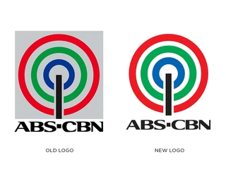
The logo 2000-2013
On 1 January 2000, ABS-CBN modified its corporate logo. The previous logo, which heralded ABS-CBN as the largest TV network in the country gave way to the present logo's styling. The tri-band circles derived from the original radio transmission waves graphic element with colors, red, green, blue with the vertical line at the center still remained and the logotype was enhanced.
Today, the tri-band radio transmission waves graphic element and the original typography are used in derivatives as logos and logotypes of subsidiaries of the ABS-CBN Corporation. Arquitectonica, a Miami-based international architecture, landscape architecture, interior design and urban planning corporation, designed the logo derivatives.
Appearance
The ABS-CBN logo features three main elements, the vertical line rooted on a horizontal origin, the three extending circles, and the text ABS-CBN. The vertical line or bar represents a tower (broadcasting tower), with the circles symbolizing its signals representing the red, green and blue or RGB colors which makes up a pixel shown on the television. The 3 divisions of the Philippines is also denoted by the three circles.

ABS-CBN was once used the logo with ABS on top and CBN on the bottom, meaning the broadcasting corporation is owned by two different families, the Quirino-owned ABS and the Lopez-owned CBN. Three circles, from the past years having no color variety, represent the three main islands of the Philippines, Luzon, Visayas and Mindanao. While the vertical bar represent the ABS-CBN TV tower. The whole logo is boxed, meaning ABS-CBN connects all the islands of the country with one family.
Then, the latter years, ABS-CBN launched The Filipino Channel, making the ABS-CBN logo unboxed, and represented as ABS-CBN is not only for the Filipinos inside, but also outside of the country. Merging the two stations, ABS and CBN, with one owner, the Lopez family, the ABS-CBN logo now uses "ABS-CBN", instead of having ABS and CBN, in one variation, situated on the bottom of the logo.
ABS-CBN's current brand positioning and visual identity
In 2014, ABS-CBN streamlined the company’s brand positioning into four pillars: (1) to be in the service of the Filipino worldwide, (2) to foster personal connections,(3) to create authentic stories, and (4) be transformational leaders.


ABS-CBN's 'sun rays'
These are evoked by four chosen ‘personalities’ for the ABS-CBN masterbrand: imaginative, pioneering, embracing, and dignified – to fulfill its determined brand promise of “creating the moments that transform, empower, and uplift,” as well as its specific brand essence of narrating “authentic, transformational journeys.”
In this light, the current logo no longer bears the serif element in both vertical and horizontal versions to better reflect the brand’s visual identity that builds “strong visual recognition and emotional connections with our audiences.”
The Logo of 2014-2020, and 2023-present
At the same time, a secondary graphic consisting of ‘sunrise’-like bleeding rings of the logo (in red, green, and blue), “based on the idea of the Filipino journey,” was introduced to further strengthen its communications across different media.
New of Early 2023[]
The Logo of 2023-present
on October 23, 2023, the new of Server Sixth Republic Of Philippines. the Color the Whole World in Manila in CEO when after 2023